
The Best Notch Apps for MacBook 2026 (macOS Comparison Guide)

When I first got my new MacBook, I did not think much about the notch.
It was just there. A black cutout for the camera with no real purpose. Unlike the Dynamic Island on iPhone, macOS does not give the notch any default functionality.
But curiosity quickly kicked in.
I started testing different notch apps to see whether any of them could make it genuinely useful. Not just visually interesting, but practical for everyday work.
Some felt experimental.
Others offered small improvements.
A few actually changed how I interact with my MacBook.
So I decided to test the most popular notch apps available for macOS and break them down clearly. What they do, who they are for, how much they cost, and which ones are actually worth keeping.
And recently, I also explored a very different use case: turning the notch into a teleprompter for on-camera presence. You can read the full breakdown here:
Moody turn Your MacBook Notch into a Smart Teleprompter
If you are wondering whether these apps are worth installing, this guide will help you decide.
Quick Comparison Table (For the Impatient)
If you just want the short version, here is a clear overview of the notch apps I tested and how they compare.
| App | Category | Price | Key Strength | Best For |
|---|---|---|---|---|
| NotchNook | Productivity Hub | ~$25 lifetime or subscription | Folder management and drag & drop | Power users |
| Alcove | Experience Focused | ~$14 one time | Live Activities and widgets | Customization lovers |
| MediaMate | Minimalist | ~€7 one time | Clean media controls | Simple daily usage |
| BoringNotch | Minimalist | Free and open source | Lightweight media and system controls | Budget setups |
| NotchBox | Simplified Hub | Free with in app purchases | Basic file and media features | Trying the concept |
| Moody | Creative Utility | $59 one time | Camera-aligned teleprompter in the notch | Creators & presenters |
Each app takes a different approach. Some enhance media controls. Others focus on visual widgets. A few aim to turn the notch into a real productivity space.
Why the MacBook Notch Is Still Underused
At first glance, it feels strange that macOS does nothing interesting with the notch. Apple turned the iPhone’s notch into the Dynamic Island, a clever interactive layer that feels intentional. So why is the MacBook notch just… there?
The answer is probably not a lack of creativity, but a matter of consistency.
Unlike the iPhone, the MacBook notch is not a universal interface surface. Not every Mac has one. Many users connect external displays where the notch disappears entirely. Building core system features around something that is not always present would create an inconsistent experience across setups.
On macOS, interface elements are expected to behave predictably regardless of hardware configuration. The notch, by design, is a hardware compromise to maximize screen space, not a dedicated interaction layer.
That leaves it in a strange position. It is highly visible, permanently on screen, yet functionally neutral. Which is exactly why third party developers saw an opportunity.
There is even an ongoing discussion about this on Reddit, which shows how divided people still are about it.
The 3 Types of Notch Apps
After testing multiple notch apps, one thing became clear. They are not solving the same problem.
- Some try to improve what already exists.
- Some try to make the notch feel alive.
- Others attempt to turn it into a real tool.
To make sense of it, I grouped them into three categories.
1. Minimalist Enhancements
These apps keep things simple. Their goal is not to reinvent the notch, but to make it slightly more useful.
They usually focus on media controls, quick system indicators, or lightweight interactions. The experience stays clean and subtle, without changing your workflow.
Examples include MediaMate and BoringNotch.
If you just want better media feedback without adding complexity, this category makes sense.
2. Experience Focused Apps
These apps lean more into the visual and interactive aspect of the notch.
They try to replicate something closer to the Dynamic Island concept, adding live activities, widgets, or animated interactions. The notch becomes more expressive and dynamic.
Alcove fits well into this category.
If you enjoy customization and want the notch to feel more integrated into your interface, this approach is more appealing.
3. Productivity Hubs
This is where things get more interesting.
Instead of treating the notch as a decorative space, these apps attempt to transform it into a functional extension of your desktop. File management, drag and drop, quick access panels, and contextual tools live directly in that area.
NotchNook clearly leads this category. NotchBox follows a similar idea in a more simplified way.
If your goal is to improve workflow rather than just aesthetics, this is the category that stands out.
App by App Breakdown
Now that the categories are clear, here is how each app actually performs in daily use.
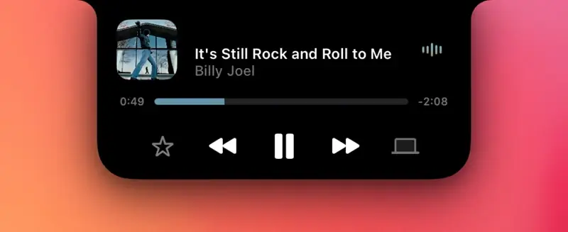
NotchNook

Category: Productivity Hub
NotchNook is the only app that made me rethink what the notch could actually be.
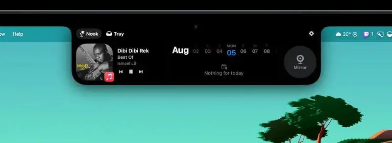
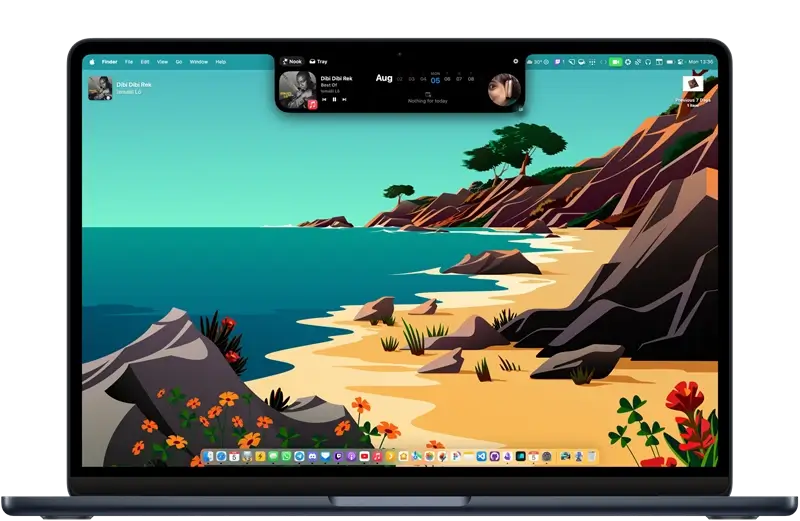
Instead of focusing only on media controls or visual effects, it turns the notch into a small utility space. The folder management feature is what really stands out. You can pin important folders and access them instantly without opening Finder.
Drag and drop works naturally. It feels integrated rather than gimmicky.
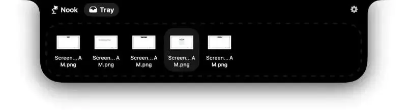
It also includes media controls and widgets, but those are not the main attraction. The real value comes from turning the notch into a lightweight file hub that stays accessible at all times.
If you are looking for something that genuinely improves workflow rather than just enhancing aesthetics, this is the strongest option.
It’s also worth noting that NotchNook is included in the Setapp subscription, so if you’re already a Setapp user, you can access it without purchasing it separately.
Alcove
Category: Experience Focused
Alcove leans more toward visual interaction.
It brings live activities and widget-like elements to the notch area, giving it a more dynamic presence. The animations are polished and the overall feel is closer to the Dynamic Island concept on iPhone.
However, it does not deeply change how you work. It enhances the experience rather than redefining it.
If you enjoy interface customization and want the notch to feel more alive, Alcove is appealing.
MediaMate
Category: Minimalist Enhancement
MediaMate keeps things simple.
Its main purpose is to provide clean and responsive media controls directly around the notch. No heavy customization, no complex features.
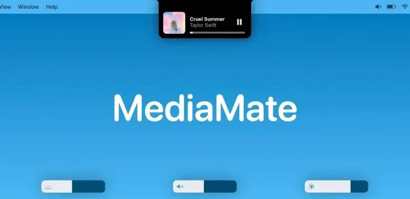
It does one thing well. When media is playing, the feedback feels smooth and subtle. When nothing is happening, it stays out of the way.
For users who want improvement without additional layers of complexity, MediaMate is a solid choice.
BoringNotch
Category: Minimalist Enhancement
BoringNotch takes a similar minimalist approach, but with an open source mindset.
It offers media controls and small system utilities without trying to turn the notch into a full interface layer. It is lightweight and does not overload the experience.

It is also a good option if you want something free and flexible without committing to a paid utility.
NotchNook
Category: Simplified Hub
NotchBox follows a similar philosophy to NotchNook but in a more limited way.
It offers basic file and media features and can act as a lightweight hub, but it does not reach the same depth in terms of integration and workflow impact.
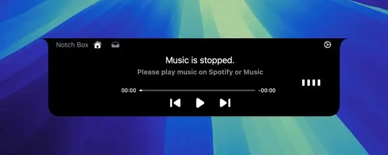
It can be interesting if you want to experiment with the concept of a notch based hub without investing in a more advanced tool.
Pricing and Value
If you are in the Mac ecosystem, you already know how this works. Good utilities are rarely free.
We could call it a cost. Or, if we want to sound like a YouTube guru, an investment.
More seriously, after testing the trials of each app and spending enough time with them to build real habits, the price stopped being the main factor.
The notch sits at the top of your screen all day. If you choose to enhance it, you will interact with it constantly. Small improvements quickly become noticeable because of how often you see them.
Once I got used to certain features, especially the ones that actually improved my workflow, removing them felt like a downgrade.
At that point, the decision was no longer about saving a few dollars. It was about choosing the app that felt the most natural to keep using long term.
My Final Choice
To be completely honest, I initially bought Alcove.
The way they present it on their website resonated with me more at first. Fluid transitions. Instant notifications. Live activities. Swipe gestures. Customizable HUDs. Lock screen widgets. A blazing fast native app.
You can probably guess that the “blazing fast native app” part caught my attention immediately, especially after the amount of time I spent optimizing this blog.
The swipe gestures also felt smart. Minimal, responsive, efficient. On paper, Alcove checked a lot of boxes for me.
And to be fair, it delivers on that promise. It is polished, smooth, and thoughtfully designed.
But after testing everything side by side and spending more time with each app, something shifted.
NotchNook started to feel more useful.
What initially looked like “extra features” turned out to be the ones that actually impacted my workflow. The folder management alone changed how I handle screenshots, downloads, and small recurring tasks. Having a persistent drop zone at the top of the screen became surprisingly natural.
Alcove felt refined.
NotchNook felt functional.
In the end, that difference mattered more to me.
So even though Alcove won me over first with its presentation and polish, NotchNook is the one that stayed installed.
The notch might never become a core part of macOS.
But in its current form, it is an interesting space. Slightly awkward. Slightly underused. Still full of potential.
And sometimes, that is enough to experiment.
More in Tech Apps
AltTab vs DockDoor on macOS 2026: Rethinking Window Switching
AltTab vs DockDoor on macOS: compare speed, previews, customization and privacy to find the best window switcher for your workflow.

The Best Screenshot Tool for Mac in 2026: CleanShot X
Discover why CleanShot X is the best screenshot tool for Mac in 2026, with powerful capture, annotation, and sharing features.
.webp&w=3840&q=75)
The Best Clipboard History Manager for Mac in 2026
macOS clipboard history is still limited. Here is the best clipboard history manager for Mac in 2026 and why it makes a real difference.